In October 2016, the web quietly passed a milestone. For the first time ever, more web pages were viewed on mobile devices than on desktop computers. This development might not surprise you given recent growth trends in mobile, but have you thought about what it means for your digital strategy? Obviously you need a mobile-friendly site (and hopefully you have one). But beyond just having one, what does your mobile site need to do? The answers become clearer once you take time to consider the evolution of mobile web design.
A Brief History of Mobile Web Design
In the early days of the mobile web, designers often assumed mobile devices were, well, mobile, used to deliver data easily while walking to a meeting or sitting on a bus. As UX designer, author and speaker Whitney Hess said in 2011, designers got “into the habit of presuming that mobile means on the go, desktop denotes a desk and tablet is on the toilet.”
But as habits changed, mobile strategy needed to change with them. Designers began focusing on providing subsets of functionality specific to various devices (checking mobile, managing desktop and immersing in a tablet). For example, a mobile banking site might have provided tools to check current account balances, but not to transfer funds or manage account preferences.
But considering that check you deposited with your phone last week, that shift wouldn’t be the last one.
It’s a Mobile World
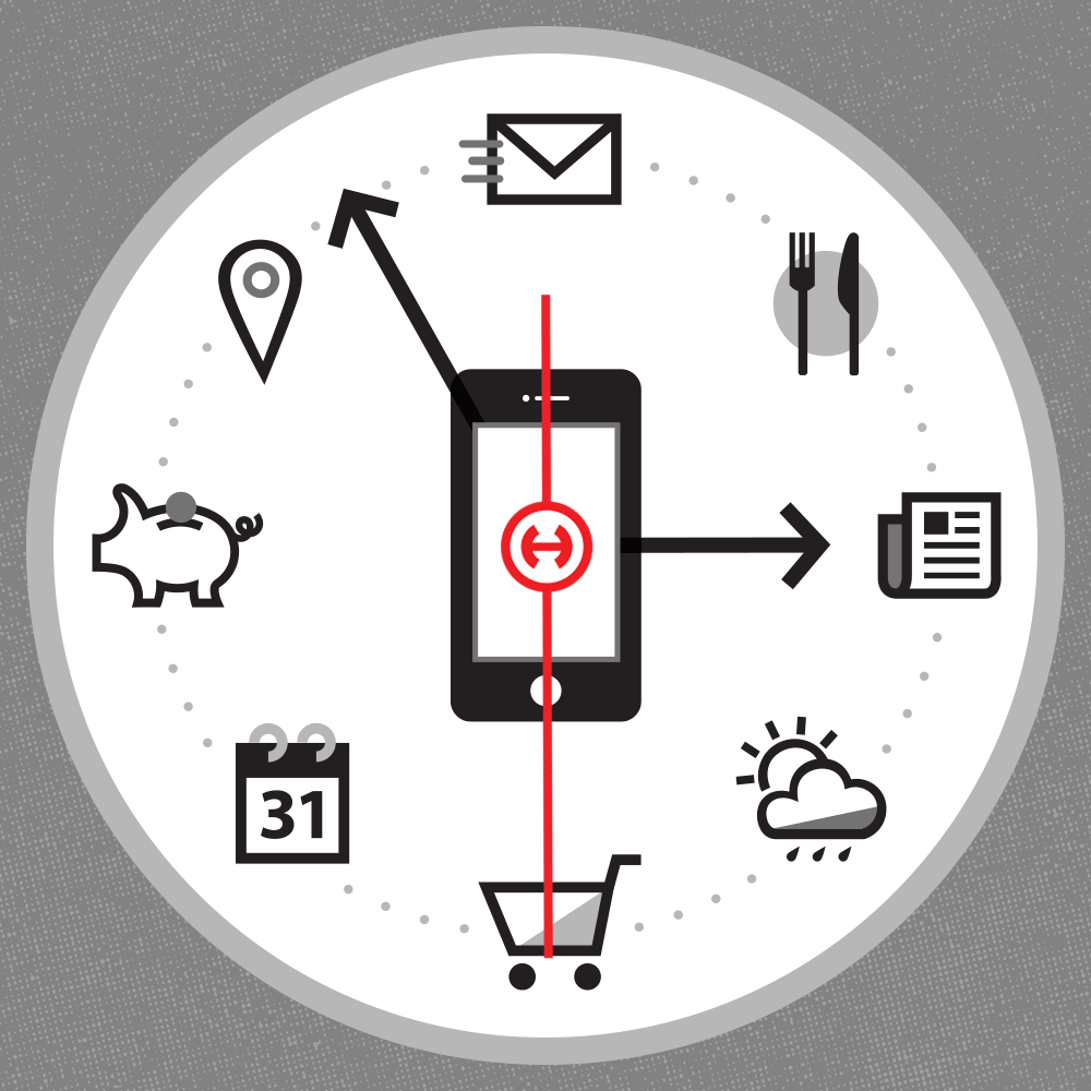
Users are no longer satisfied with device-specific experiences; they not only want but expect to be able to access the entirety of a site and its capabilities from any device to do whatever they want to do. And as it turns out, they’re doing a lot of things.
According to a Pew Research Center survey of smartphone owners, people are now likely to do even highly interactive tasks on their smartphones, such as online banking (57%) and filling out job applications (18%). These days, some people fill out their tax forms on mobile: TurboTax’s Android app has been downloaded more than 1 million times.
As mobile continues to take on a larger share of web use, there’s no guarantee your site’s visitors will ever see the desktop site. For many out there, today’s world isn’t just mobile first—it’s mobile only.
Designing for Mobile
This is why techniques like mobile first and responsive design are not optional—they’re vital. Consider this: if the mobile version of your site is the only one visitors ever see, are you still making the best possible first impression? Are you providing a full set of features? If a user comes to your site on their smartphone and cannot do something they want to do, they’ll quickly ditch your site in search of one where they can. So it’s more important than ever that your mobile site provides a seamless and rewarding user experience.
Using Mobile to Take the Lead
In light of how quickly mobile is advancing, you’ll want to keep your eye on the following (we are!).
- Smartwatches and other wearable technology. As their radically tiny screens begin to push the limits of what humans can see and manipulate, these devices deserve to be considered when planning your digital strategy. How can wearables be used to provide true value vs. just a novelty experience? And given that those who wear smartwatches also carry smartphones, how could the two devices work together to spotlight and leverage your brand’s products and services?
- Augmented reality. Technology like Google Glass is a ways off, but smartphones will increasingly break down the divide between physical and digital by way of augmented reality technology. AR is already helping customers visualize furniture in their own home and preview makeup before buying. In the near future, this technology will continue driving engagement by offering customers the opportunity to contextualize and personalize retail experiences.
- Bots and the Internet of Things. And, finally, in one sense the dominance of mobile page views might be a temporary trend, as technologies like Amazon Echo and the Internet of Things gain more prominence—ultimately moving digital interaction beyond traditional page views in terms of both experiences and measurement.
For now, mobile is the platform of choice for more than half of web users. Brands must respond accordingly with feature-rich mobile-optimized sites that let users do everything they want on the devices they prefer—and do so in a way that comes naturally to them. Sound like a lot? We can help. Contact Ted at tjun@hiebing.com to discuss how Hiebing can optimize your website and deliver the mobile experience your customers not only want, but expect.