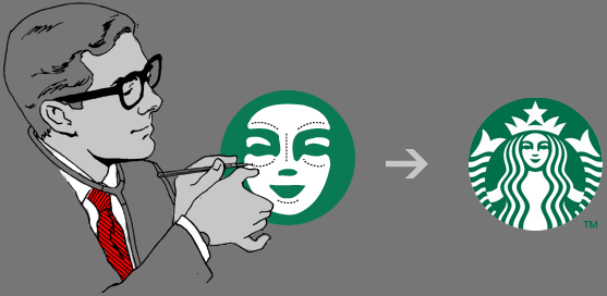
Starbucks made headlines this week for its redesigned logo, which drops “Starbucks Coffee” from the ring around the siren. But how many people noticed the less obvious tweaks to the visual? Yep, the Starbucks siren got a facelift. It’s a subtle evolution but that small detail makes a big difference.
